amylily
on 31 March 2022
MasterClass: Concept design
Concept design is the fundamental of interaction design and the deepest level of design decisions. A concept in this context is described as a bridge between the designer and the users, who will only be able to make effective use of the interface if they grasp the underlying intent of the concept that is designed.
A concept consists of three parts:
- Purpose
- Structure
- Behaviour
Let’s look at the concept of a MacOS trash as an example.

The purpose of a trash in this case is to allow users to undo deletions. Based on this purpose, when the main action “delete” is performed, we know that it is an action we could undo. The structure of this trash is in a folder structure, meaning, it can contain both folders and files. This is important because the structure allows us to understand which actions can be taken with this concept. Finally, we have a behaviour. The behaviour shows us that whenever we delete a file or a folder, it is actually moved to a different folder called “Trash”. This will allow us to move it back to its original directory if we changed our minds. Only if we decide to “Empty trash” will we entirely remove the files in our “Trash” folder.
Concepts can be reused
When a concept is defined, one of the most powerful properties of a concept is the ability to reuse them. Concepts can be reused through many platforms. For instance, the concept of “following” someone on Twitter allows a user to declutter the posts and only see content from people that you care about. This same concept is efficient enough that it has been reused in multiple other platforms like instagram, facebook, etc.
The fundamental principle
1-1 mapping between purpose and design
In a well designed system, a concept should be driven by one purpose and every purpose is fulfilled by one concept.
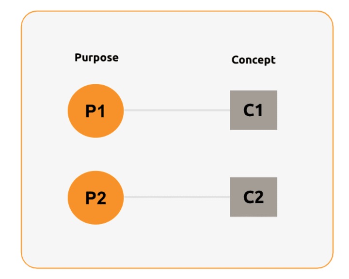
Given that the rule of thumb is to always have a mapping of 1 concept : 1 purpose, it is also important to remember two things associated with this principle.
Embrace familiarity
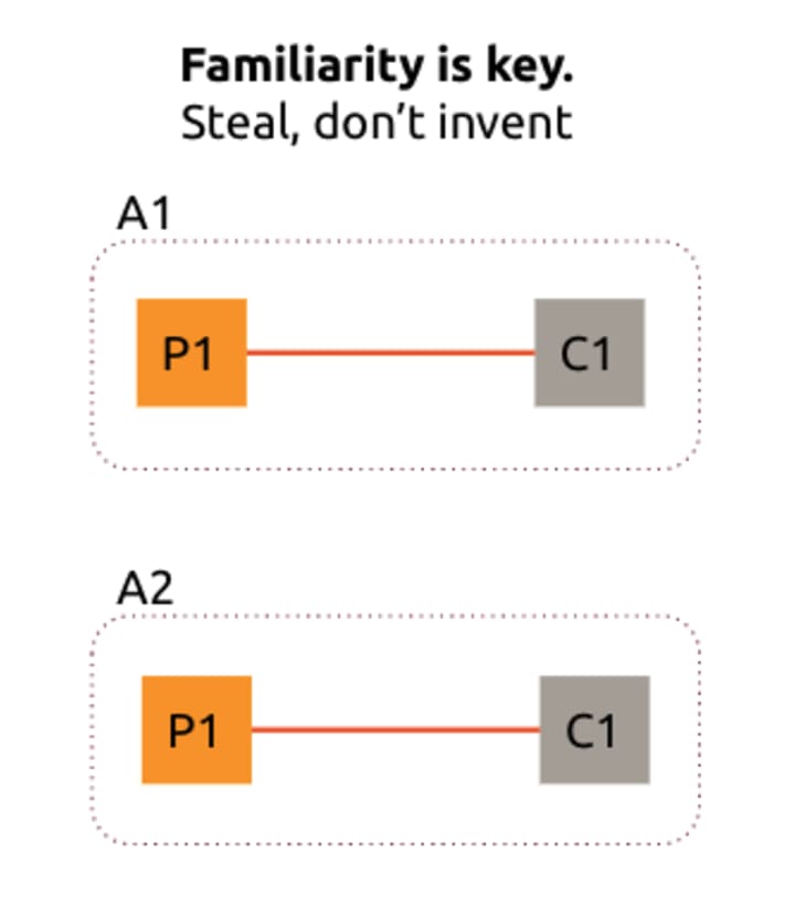
We talked about how concepts are reusable and that is one of its charms. When you have two applications A1 and A2, they both have the same purpose P1, instead of inventing an entirely new concept to fulfil the same purpose, we should consider reusing the concept that has already been proven to work.
Preserve the Integrity of the concept
When a concept is created, you should preserve its behaviour once it’s composed. For instance, when you need two concepts to work with each other, their behaviour should not interfere with one another.
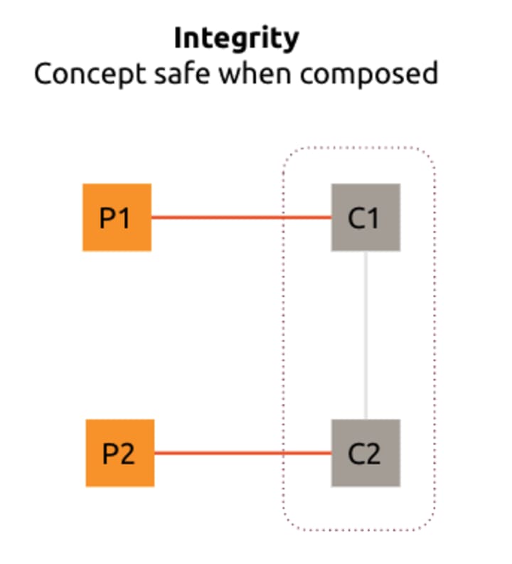
One example of a concept that violates the integrity rule is how Google Drive and the concept of sychronisation clashes, and that led a user to lose their entire life’s work. Their experience can be explained as below:
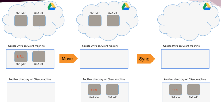
Basically, Google Drive has a concept of client machine drive, which mirrors the files and folders on google drive. In this example the user had a pdf file and a google doc file in this drive and synced it to the local machine. Now, to save space on google drive, this user moved the mirror files from the local machine to a different folder in the local machine.
Google Drive followed the concept of synchronisation, so it attempted to sync the file in the local machine with the Drive. Unfortunately, this was an integrity violation of a concept. As a result, the cloud was empty after the syncing process.
What really happened here is that when you synchronise the file from the cloud, you don’t get a copy of your file. Instead, you get a URL that points to that file if it’s a cloud application file like gdoc. Although the pdf file is copied reliably, the google doc files are not copied during the sync. As a result, there is no data sitting on the client’s machine. So when you move the URLs to a different location, you are left with a URL to gdoc with no data after the sync.
Unfortunately for the user, the cloud application file concept is breaking the synchronisation concept. The synchronisation concept tells us that when you sync a file, files on both sides should be the same. However, there is an exception to this rule that if it’s a cloud application file, only the URLs are copied and not the actual file. At the end of this very bad experience with google drive, the user registered the domain name googledrivesucks.com.
Four ways to break the fundamental principle
One might think that “one concept should fulfil one purpose” is a simple rule. But there are four different ways in which us, concept designers, may break the rules unintentionally.
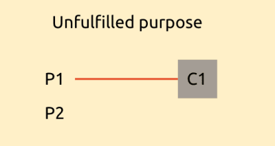
Unfulfilled purposes
This scenario occurs when you have a concept C1 that fulfils a purpose P1, but you also have a purpose P2. In this case, there is no concept to serve this purpose, leaving the user without possible solutions for P2.
Unmotivated concepts
Unmotivated concepts are described as a scenario where a concept is created and without serving a purpose, and there is no clear reason for its existence. This sometimes occurs when a new concept is introduced to mitigate existing design flaws, leaving users confused to as to why it exists at all.

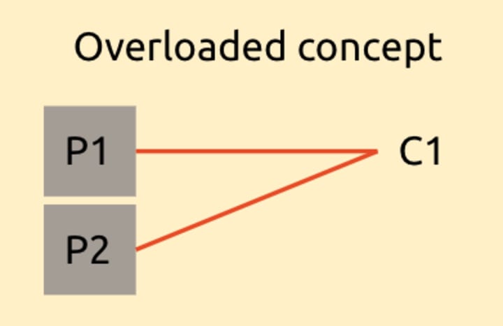
Overloaded concepts
When you try to fit too many purposes into one concept, you are introducing a flaw called overloaded concepts. This is the most common scenario when designing a concept, and introduces a lot of usability problems. When two purposes are tied together, a user cannot fulfil these requirements separately, except by combining them.
Redundant concepts
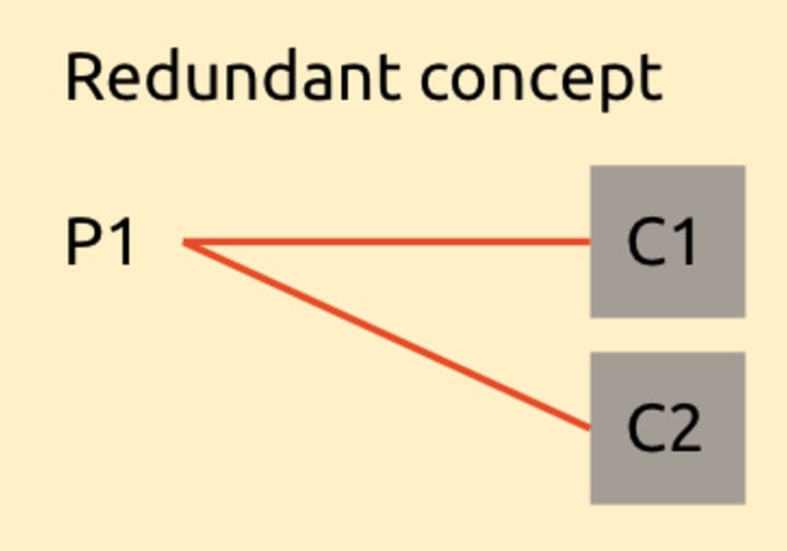
Redundant concepts occur when creating a new concept to fulfil a previously fulfilled purpose, without adding any value to the existing concept. One classic example of redundant concepts is the ability to “categorise” emails in gmail VS the existing concepts “label”. When the concept of “categories” was introduced, there were a lot of users confused about it, because there was an already existing concept called “labels”, which helped them organise their inbox into categories.
Conclusion
A concept is a bridge between designers and users, and it is defined by three parts: the purpose, the structure, and the behaviour. In a well designed system, one concept is motivated by one purpose. A good concept should be reusable across different applications. Lastly, embrace familiarity and always preserve the integrity of the concept.
Read more about concept design:
Jackson, Daniel. 2000. “6170 Lecture Notes.” Accessed September, 2019. http://people.csail.mit.edu/dnj/publications/fall00-lectures.pdf
Jackson, Daniel. 2021. “Podcast: Rethinking Concepts”. https://cap.csail.mit.edu/podcasts/rethinking-concepts-software-design-daniel-jackson
Jackson, Daniel. 2020. “Concept Design”https://people.csail.mit.edu/dnj/talks/eross20/eross20.pdf
Jackson, Daniel. 2019. ”Design by concepts”https://people.csail.mit.edu/dnj/talks/ssft19/ssft19-builds.pdf


